eBook vs. Print Book Covers: Key Differences Authors MUST Know
You’ve finally finished your book. You’re staring at that shiny new cover design, proud, excited, maybe even a little teary-eyed. It looks great on your laptop. You’re ready to upload to Amazon and place a print run order. One cover to rule them all, right?
Wrong.
Here’s the plot twist: the rules for ebook and print book covers aren’t just “slightly different.” They’re completely different, like texting vs. handwriting a love letter. One’s made for screens, the other for shelves, and pretending they’re interchangeable? That’s how perfectly good books get buried.
A seasoned book cover design company knows this inside out. But many authors, especially first-timers, learn the hard way. Covers get pixelated. Spines vanish. Blurbs get sliced off like a bad haircut. Sales tank, and it’s not because the book’s bad. It’s because the packaging didn’t play by the rules.
So, let’s unpack the biggest design differences, facepalm-worthy mistakes, and pro tips you’ll wish someone had told you before launch day.
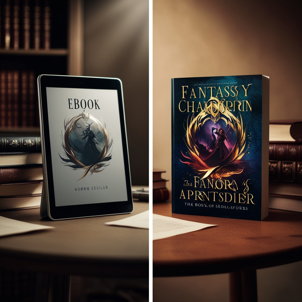
Digital vs. Physical: It’s Not Just About the Format
Think of ebook and print covers like fraternal twins. They come from the same place (your manuscript), but they’ve got totally different needs, environments, and pressure points.
An ebook cover lives online, squished down to the size of a thumbnail. It's all about instant impact, clarity, and emotion from a screen away. A print cover, on the other hand? It’s tactile. It’s got a spine. It’s got a back. And it better look good in someone’s hands or on a bookstore shelf next to 47 other titles in your genre.
A top-tier book cover design company doesn’t just resize the same file; they rethink the design entirely.
The Dirty Details: What Actually Changes?
1. Dimensions & Resolution
Ebook covers are like digital billboards. Amazon recommends a 1:1.6 ratio, usually around 1600 x 2560 pixels. That’s your sweet spot for crisp resolution on Kindles and tablets. But if you use that same file for printing?
Get ready for disaster.
Print covers need bleed extra space around the edges to account for trimming and spine width, which depends on your page count. Miss those specs? Your title gets lopped off, or looks like it’s wearing pants three sizes too small.
True story: I once met an author who submitted their ebook cover for print. The spine was off by half an inch. When the printed copies came in, the title was nearly folded into the gutter. Brutal.
2. Color: RGB vs. CMYK
Ebooks use RGB (red, green, blue), optimized for glowing screens and bold saturation. But printers don’t speak RGB. They use CMYK (cyan, magenta, yellow, black), which can turn your dazzling electric blue into... sad oatmeal gray.
Book cover design companies utilize calibrated monitors and print previews to accurately convert color modes without compromising the mood, because nothing says “amateur” like colors that look great online but appear faded in real life.
Pro tip? Always ask for a CMYK proof. It’s the design equivalent of checking your outfit in sunlight before a big date.
3. Typography: The Art of Being Seen
Ebooks live and die by the thumbnail. You’ve got one inch literally to scream, “Hey, this book slaps!” That means bold fonts. High contrast. No clutter.
Print covers? They get to be a little fancier. Readers are holding the book, not squinting at it on a phone. You can use finer type for blurbs, bios, or subtle genre flourishes. But the spine? That’s your silent salesperson. If the font’s too small or too light to read on a shelf, you’re toast.
A book cover design company doesn’t just “choose a font,” they engineer legibility like a chef picking spices: subtle when needed, punchy when it matters.
4. Back Cover & Spine: Ebook’s Missing Puzzle Pieces
Ebooks don’t have spines. They don’t have back covers. Your Kindle doesn’t flip anything over. But print books do, and readers judge them fast.
Your back cover is prime real estate. Blurb? Tight. Author bio? Compelling. Barcode? Placed like a ninja. And the spine? It better be readable, branded, and straight as an arrow.
I've seen beautiful front covers ruined by crooked or invisible spines. Some bookstores refused to shelve them forward-facing because the title vanished. That’s how books die quietly, faced backward.
5. File Formats: Your Upload Nightmare Awaits
Ebook retailers prefer JPEG or PNG files because they are simple, fast, and lightweight. But print-on-demand platforms? They demand PDF/X-4 with crop marks, embedded fonts, and the aforementioned bleed.
If you send a JPEG to IngramSpark, you might as well email them a selfie. They’ll kick it back. Maybe with a note. Maybe not.
A solid book cover design company delivers all the right files, ready for every platform. You? You just upload and hit publish.
Mistakes That’ll Wreck Your Launch (And Your Reputation)
- Low-res ebook covers: That 72dpi image looks fine on your laptop, but it turns into a blurry mess on high-res screens. Always go 300dpi. Always.
- No bleed on print covers: Text cut off. Borders missing. It’s like printing half a painting and calling it art.
- Wrong spine size: Too narrow? The title disappears. Too wide? It looks like your book’s wearing shoulder pads.
- Color mismatch: That neon pink looks hot on screen until it prints out as dusty salmon.
These aren’t “oops” moments. They’re sales-killers. Don’t learn the hard way.
The Cost of Cutting Corners
Let’s be real, designing two covers costs more than one. However, hiring a book cover design company that offers bundled packages (e-book, print, and possibly audiobook) is still cheaper than a failed launch.
Sure, you can find a Fiverr deal for $75. But will they know how to build a spine? Or convert RGB to CMYK without tanking your aesthetic? Or handle PDFs with printer specs?
Probably not.
Your book’s face deserves better than a quickie template. Don’t blow months of work just to save $100.
Final Word: Format Isn’t Just a Checkbox, It’s a Strategy
Whether it’s a pixel-perfect ebook or a shelf-ready print version, your cover is your first impression. In publishing, first impressions last.
Don’t wing it. Don’t guess. And for the love of libraries, don’t use the same file twice.
A seasoned eBook cover design company takes your vision, formats it correctly, and delivers a cover that sells in both print and digital formats.